02Jan
Toning the Canvas
Whether I'm painting indoors or out, and regardless of subject matter, I always begin by toning the canvas—spreading a wash of paint thinned with turpentine on the primed canvas. I use a warm tone of a middle light value. If I start with a tone that's too dark, I end up having to adjust my color, getting it lighter and lighter as I go along. The exact tone that I end up with tends to be uneven, as you can see from the way I apply paint—and I like it that way. I usually have toned canvases of varying sizes on hand, and pick one best suited to the picture I have in mind. Although I may tone a canvas on location, I often prefer to use already prepared ones so that I don't have to wait for the surface to dry. If you apply tone to your canvas outdoors in cool or damp weather, it will be slow to dry, and your brush may pick up some of this underlying color when you apply paint over it. The result is muddy color, especially in sky or other light areas.
Tone covers up the white of a primed canvas, which can be misleading in a developing painting. You can put a very bright light—a color that might well be a focal point in your painting—on a white canvas and it will barely show up, leading you to conclude that the color is wrong because of its lack of impact, when it's really the context in which it's been placed that's misleading you. Similarly, other values, if judged against white, can look darker than they would in the context of the painting, or against a toned ground.
The tone of the canvas is, for me, much better to judge values against. When you're looking at your subject, trying to gauge value and color, you're looking at tones, not white; so why not put a tone on your canvas to start with, to make those judgments easier?
You can use the canvas tone to convey light areas of your composition in the block-in. If you put a relatively dark value down against this light tone, you can get an immediate sense of the pattern of light and dark developing, and begin to see a suggestion of form. Thus it enables you to establish your painting design before dealing with the intricacies of color and opaque paint.
Allowing the tone to show through here and there in the finished painting provides unity. If the same warm tone shows through in both sky and grass, for example, it suggests a common light source and a unity in the color of light. Letting a warm tone shine through any cool area will also add luminosity to your painting. A warm, orange tone shining through cool, blue shadows on snow provides an exceptional glowing feeling. Similarly, a warm, reddish tone beneath any green area will make those greens vibrate with light. So if you're painting a subject with lots of intense green, try a canvas with a slightly darker, redder tone. The viewer may not even notice these complementary-color areas showing through. The eye actually sees these tones individually at a distance, but the brain interprets them together as a vibration that reads as luminosity.
Toning the canvas. With a large brush, I scrub color thinned with turpentine into the canvas. I usually use cadmium yellow light, cadmium orange, or cadmium red, and sometimes a little ivory black or ultramarine to gray the mixture slightly. The tone varies somewhat from canvas to canvas. I wipe the paint down with a paper towel, covering the canvas. I'm careful not to press too hard, which will cause the canvas to press against the stretchers, leaving indentations. Sometimes I add a little turpentine to the paper towel to make the paint easier to spread or to thin it if the tone is a bit too dark.
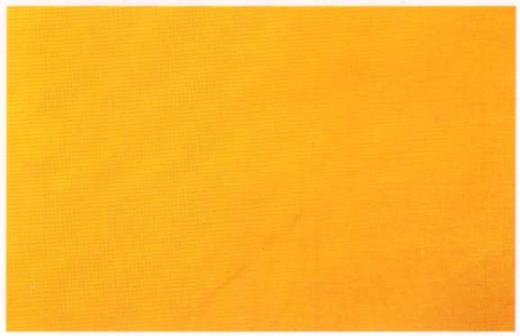
Once the canvas is covered, I wipe away excess paint and turpentine, leaving it stained with a warm, light value, then I tap or blow on it gently to remove any bits of paper towel that might be clinging to the surface.
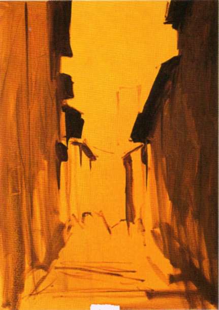
Step 1. For the block-in of this street scene, I begin by filling in dark shapes, representing the sides of the buildings in shadow.
Step 2. I continue blocking in shadow areas. I'm not as interested in color as I am in establishing a pattern of light and dark that I think is interesting and attractive. Notice how the canvas tone reads as light, which helps me design the painting.
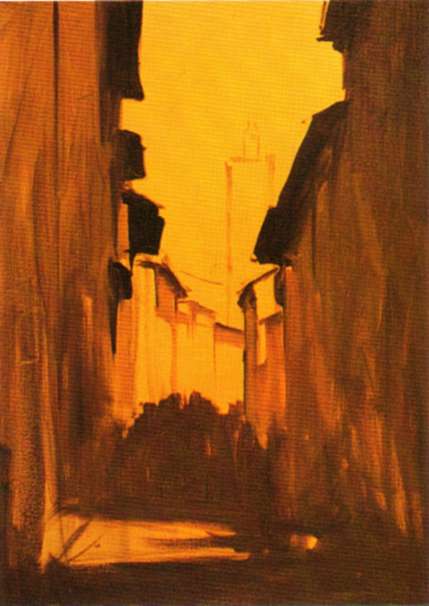
Step 3. Applying opaque paint to light areas of the block-in, I want to establish these lights before working on figures silhouetted against them. I try not to concentrate on shadows without putting some lights against them. That way, it's easier to judge their relative value.


